# Simplification
Because pixel art is so restrictive, it's more important to show a few important things clearly, (opens new window) than to try to show many details.
# Noise
Every detail grabs some attention. Too many details ends up making the sprite look crowded and confusing, and distract from the important parts you want to show.
Textures that use many single pixels, or 1-pixel-wide lines, will create a lot of visual noise, as well as being difficult to animate. This usually includes thin stripes, tiny dots, or individually drawn scales or feathers.
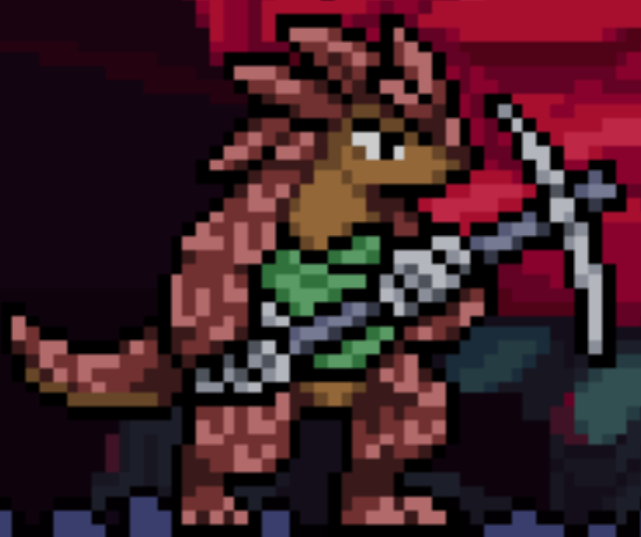
Workshop character Anstein had individually drawn scales, crowding the body with noise. The project was eventually
scrapped and restarted because the character was too difficult to animate.
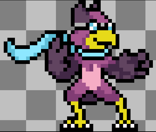
Wrastor doesn't have many tiny feathers drawn, but communicates feathers through the shape and shading of his arms.


# Clusters
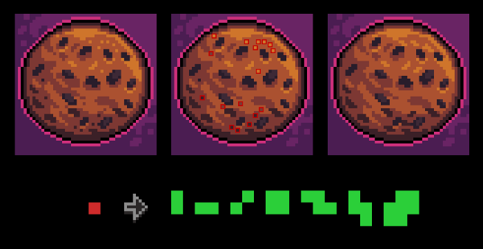
Clusters are connected areas of the same color. (opens new window)

Each cluster grabs some visual attention, especially if they contrast with neighboring pixels. Using fewer clusters and keeping clusters larger will keep the sprite clear and readable.

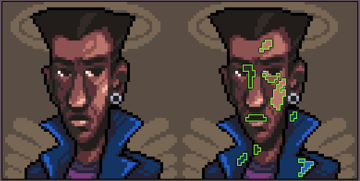
Rivals sprites will have small clusters, especially around hands and faces. What matters is that the clusters are conveying important information.

![]()